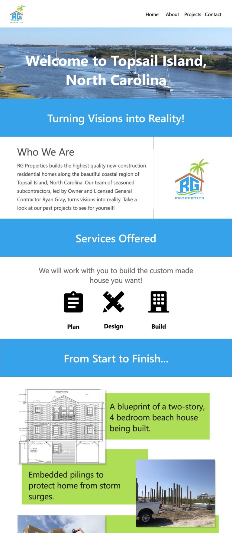
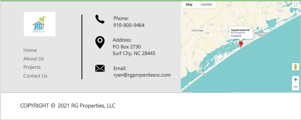
Project: Ryan Gray Properties, LLC Website Design

Role: UX Researcher/Designer / Winter 2021


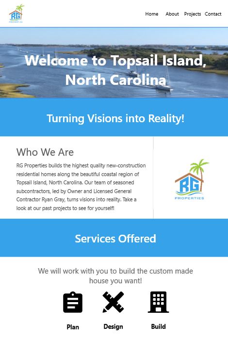
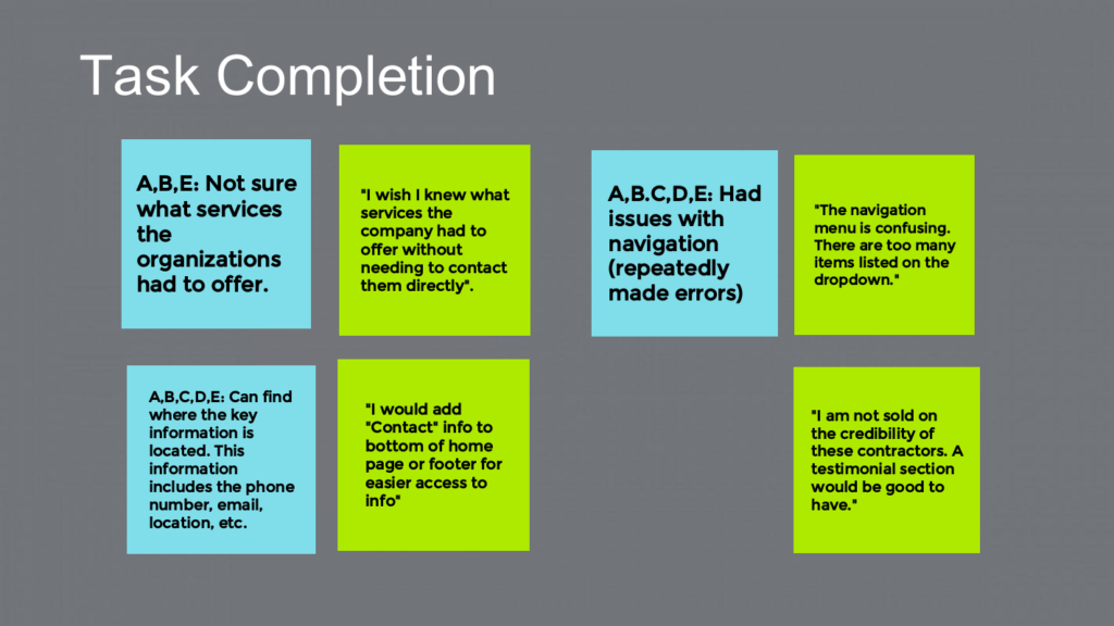
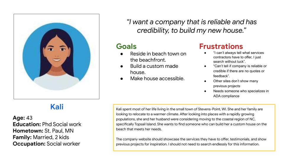
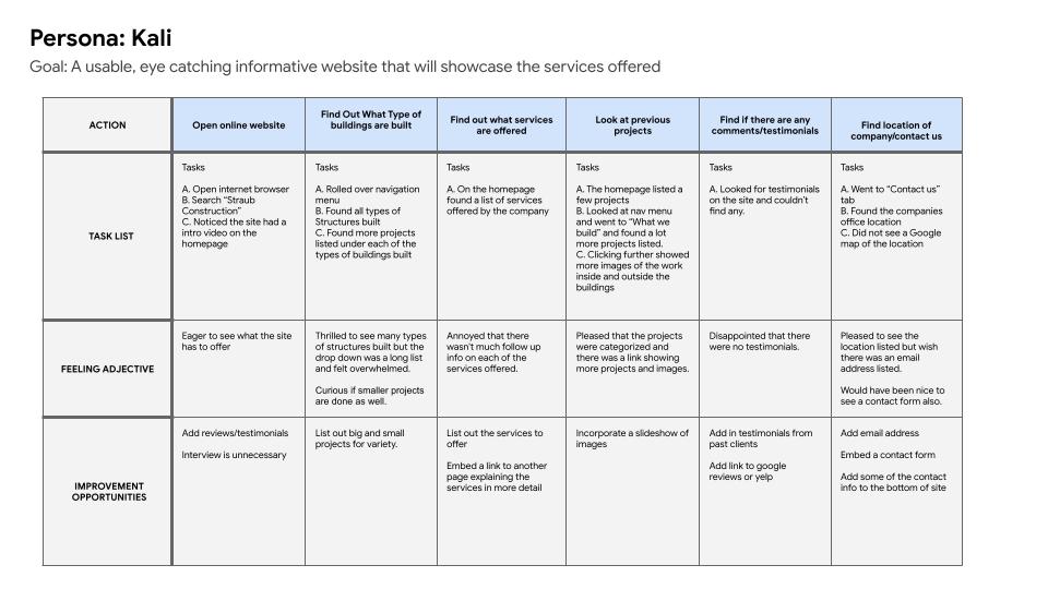
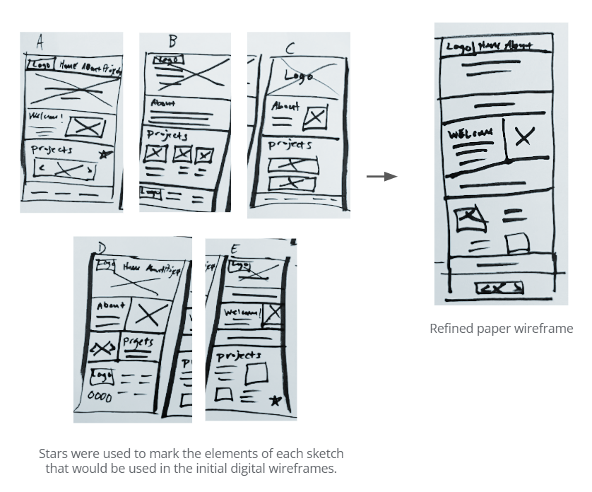
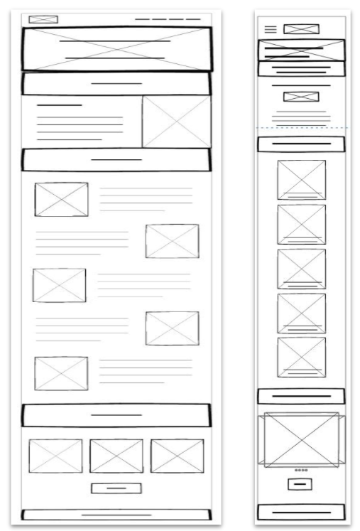
This project was for a User Experience Design course offered by Google. The objective of the study was to observe users as they interacted with the website for Ryan Gray Properties (RGP)

Tools used: Adobe, Zoom, marker and paper

Project Vision

The end goal is to design a website for RGP that is user friendly by providing clear navigation and offering easy access to important information.

Challenges

1) Create a simple navigation menu that is easy to use

2) Display information in an appealing format that is easy to read

3) Present key information front and center so it is easy access

Initial Research

To begin the research process I ran a usability test using several contracting sites. These sites were: Hare Construction, Straub Construction and Maple Leaf Construction Ltd. I presented users with a series of tasks and asked them to describe how they felt throughout the process. After, I took the information I gathered to generate research questions that would enable me to meet the research goals I had set.

“Who is the target audience?”

“Are users able to find key information with ease?”

“What can we learn from the site layout and its ease of use?”

“Are there any parts where users are getting stuck?”

“Is the site structure formatted well?”

Affinity Diagram

From my initial interview/usability testing, I  used an affinity diagram to categorize the data into groups of tasks with additional quotes from participants. Observing the successes and issues users had while using the websites site allowed me to have a better understanding of the improvements that needed to be made.

Meet the User

Problem statement:

Kali is a social worker who is married and has two kids who needs to find a reliable contractor because she wants to build a custom made house with someone who she knows can decide what’s best for her needs and budget.


Journey Map

Findings

Often sites list too much or not enough info along with a busy design and a confusing navigation system, this negativity impacts the user flow generating a non-enjoyably experience for the user.

Wireframe

After sketching out some wireframes and taking into an account the users journey, I was able to make note of what elements were needed and what elements could be omitted.

Iterations

After drawing out the low fidelity wireframes and creating the prototype of the website, I prepared a survey questionnaire consisting of 10 questions for participants to fill out following the usability test. I asked 5 different participants to run through a series of tasks within the prototype in order to gather feedback to use for future design iterations.

Confusing Navigation Menu

Navigation had too many drop-down options.

Important info was hard to find

Important information such as the contact info and services was hard to find.

Unsure of company credibility

With no reviews or testimonial people are unsure of the company’s credibility and whether they would be a reliable partner.

CHALLENGE 1

Simple Navigation

A simple navigation menu that scrolls down the page to the section selected will eliminate the need for multiple individual pages.

CHALLENGE 2

Easy Access

Key information should be displayed so users can find what they are searching for quickly. Putting the contact information in the footer allows users to access the information across all pages on the site.

CHALLENGE 3

Credibility

A testimonial section allows users to know if the company is reliable and worth partnering with without needing to look at other outside sources for reviews, thereby improving their overall experience.

RGP Website Walkthrough of
Prototype

Takeaways

Impact:

This website helped users feel informed about the services offered as well as the quality and credibility of the company.

What I learned:
I have learned that sometimes simplicity in design goes along way when creating a site that is functional and appealing.

error: Content is protected !!