Project: BeyondSoundx (BSX), App/Product Design
Role: UX Researcher/Designer / Spring 2020
This project was for an undergrad capstone course.
Tools used: Renderforest.com, Touch Designer, Adobe After Effects, Adobe Illustrator, Autodesk Maya
BeyondSoundx (BSX) aims to generate a musical experience that goes beyond sound. BSX provides an opportunity for Deaf and Hard-of-Hearing people to experience the power of music. By taking in audio and transmitting the music to a visual representation using color and vibration the user can enjoy a visual and haptic musical experience. The user is in full control of their musical experience. This is not limited to Deaf/HOH audiences and will expand the joy of music for all users.
PROJECT INSPIRATION
A few years ago, a friend of mine who is a superb saxophone player had a music recital to which he invited the other students in our American Sign Language (ASL) class as well as our instructor who is Deaf.
A few days later, it occurred to me that some Deaf people might choose to not partake in concert events if they cannot “hear” by feeling the music. If the performance consists of more instrumental music with softer or quiet instruments it can be harder to “hear” the music. This came as a revelation to me because it was something that never crossed my mind. I am also deaf but I have been a Cochlear Implant (CI) user since I was two years of age. Being profoundly deaf while having CI has allowed me to hear sound. From a young age, I have become accustomed to sound. Sound has always been a part of my life, so for me to take off my CI and be surrounded by silence feels strange. For this reason, I never considered what the music experience is like for other Deaf/HOH people who choose not to use a hearing device.
This interaction along with a summer internship I did at The Wilson Center at Cape Fear Community College (CFCC), sparked the idea for my Capstone Project.
The Wilson Center is a local performing arts center. Everything from Broadway shows, musical performances, dance to other entertainment options are offered. During my internship, I was given the task of researching ways the Wilson Center could improve its existing accommodations for people with disabilities. As a deaf person, I took note of the accommodations available to Deaf and Hard-of-Hearing (Deaf/HOH) patrons. These include assistive hearing devices, closed captioning and Certified American Sign Language (ASL) interpreters available at all live performances.
These experiences led me to consider ways to make non-lyrical music more accessible to people who are Deaf/HOH, by creating a visual and haptic experience that can expand on the ways music can be enjoyed.
During an interview with an Accessibility Specialist from the Wilson Center, I found that some people wanted a visual way to experience music aside from the haptic vests the Center has to offer to enhance their overall experience. To begin my research I investigated other products that explore a similar concept.
PROJECT DESCRIPTION
If a Deaf/HOH patron were to attend a symphony or any music event that is non-lyrical, the options for accommodating the person would be somewhat limited. For this reason, my idea is to create a mobile app that can take music and convert the sound to vibrations, while displaying a visual representation of the music. The app will have the capability of connecting to a wristband allowing Deaf/HOH patrons to experience non-lyrical music, hepatically, and visually in a performing arts setting. The user will be able to feel and see the music as it’s being played in real-time. As a result of creating this device, music will be more accessible to the Deaf/HOH population.
PURPOSE
My goal is the creation of a mobile app that can take music and convert the sound to vibrations, displaying a visual representation of the music. The app will have the capability of connecting to a wristband allowing Deaf/HOH patrons to experience non-lyrical music, hepatically, and visually in a performing arts setting. The user will be able to feel and see the music as it’s being played in real-time. As a result of creating this device, music will be more accessible to the Deaf/HOH population.
AUDIENCE
The wristband will be created for Deaf/HOH people 8 years and older, while the mobile app will be designed for people ages 5 and up. According to the American Community Survey (ACS), conducted in 2011, “… about 11 million individuals consider themselves deaf or have serious difficulty hearing”. While the incidence of Deaf/HOH may be relatively low, there are still Deaf/HOH people who could benefit from this product. The mobile app and the wristband will enable the wearer to feel and see the music, extending how Deaf/HOH people experience music. Both products could potentially be expanded to anyone who wishes to experience music beyond the sound component.
INITIAL IDEA
Audio Visualization
Renderforest
To start this project, I researched a variety of audio visualization programs online, these included Renderforest Music Visualizer and Videobolt Music Visualizer to name a few. These programs made it easy to upload a track and render quickly. However, these programs limited the options for visualizing to a small number of effects. The duration of the track was also limited. These programs were not the best option when working with a budget. This led me to utilize the resources I have at my disposal through a variety of multi-media software options to visualize the music effectively, at a lower cost.
After Effects
Using After Effects I decided to create an audio spectrum. With limited experience using After Effects, I researched a way to visualize music. I created the visualizer based on an uploaded track, where I manipulated the high and low frequencies of the song and assigned each frequency to a band on the color spectrum. A problem with using After Effects to create the visualizer is that I was unable to easily change the track later or have it programmed to render immediately based on a new track.
Touch Designer
Along with using After Effects to create a visualizer, I experimented with Touch Designer. An advantage of using Touch Designer over After Effects is that it is easier to switch out the tracks if necessary as it is a live / pre-rendered software system versus one that has to be rendered to see a final output. Touch Designer renders the file based on the newly uploaded track and adjusts the visuals according to the music on demand.
INSPIRATION FOR BRAND NAME
When I first started brainstorming ideas for a Brand Name, I came up with a list of words that pertained to sound, color and touch. These included: Beat, Vibro, Glow, Pulisic, Illuminate, Radiance and Hue. After more thought, I decided I wanted the name of the brand to be something more general and not specific to the physical product I have in mind but rather an experience. An experience that all people can take part in.
The next set of ideas I had for the brand name, included: RadiantX, MusicExpansion, WaveXp, WaveRadiator.
I finally settled on beyondsoundx, because it implies there is something more to music than just sound. The x is short for experience. This means that people can be in control of their experienceLOGO DESIGN PROCESS
The process of creating the logo for BSX, went through several iterations. Starting out with a gradient filled box with white text seemed boring and unoriginal. Based on feedback from classmates and instructors, they wanted me to experiment with other possible designs. This led me to try some new ideas using a wavy looking “X”. I felt that an “X” with a slight curvature to it would coincide with the flow of music. The wavey lines in my finalized logo represent sound waves, while the gradient showcases the colors of music.
FUNCTIONAL SPECIFICATION OF APP
The mobile app will:
1. Allow users to connect to audio using the built-in microphone of a smartphone and/or upload a music track.
2. The phone will vibrate based on the volume and display a visual representation of the music according to pitch.
3. Options will also be provided allowing users to decide if they
want both vibration and display at the same time or just one feature
over the other.
4. Allow for a connection to a smartwatch or a wristband via Bluetooth
5. Have the option of connecting to a HDMI cable for an on-screen visual display
BSX MOBILE APP PROTOTYPE
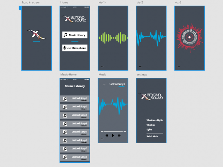
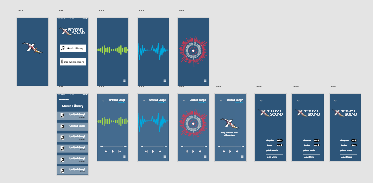
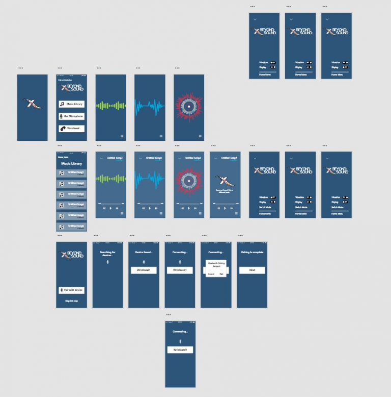
The prototype for the BSX mobile app was created using Adobe Xd. This app is specifically designed for an iPhone X/XS/11 Pro. I created several variations of the app.
The first version of the app I designed was a mock-up, just laying out how I wanted the app to look. At this stage of the process, there was no user interaction involved.
Version 2 of the app had some interactivity which I had some people test out and provide some feedback on the look and feel of the app. These people reported that they liked the color scheme however, the buttons on the settings page were not working.
The most current prototype of the app is more functional. Below is a link to an interactive site that showcases the layout and set up of the BSX mobile app in its most current form.
Feel free to try it out:
FUNCTIONAL SPECIFICATION OF WRISTBAND
The wristband will:
1. Vibrate based on the volume and music visualizer will adjust according to the pitch of the music
2. Have an adjustable wrist band
3. Connect to a smartphone via Bluetooth
Material:
1. 3D printed – Silicon strap
2. Vibration motor
4. Microprocessor/Bluetooth
5. Screen-display
3D MODELING
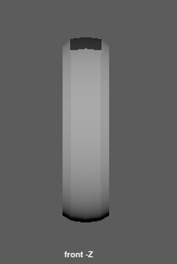
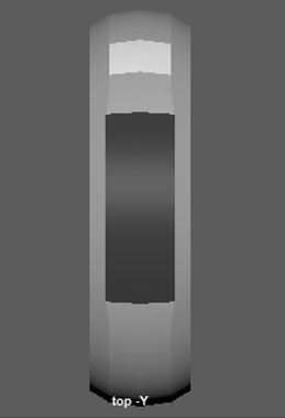
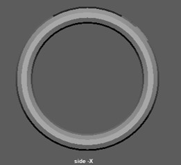
Using Maya, I modeled three versions of a wristband.
The first two versions of the wristband were designed with the intent to vibrate and flash in color based on the pitch of the music. Each of the bars on the face of the band corresponds to a pitch based on an octave. When a certain note is hit the wristband will light up in color.
After I made the decision of using an app to connect to the wristband, I created a second version of the wristband with a screen display. This would allow the user to have a visual representation of the musical pitch and feel the vibration of the music based on its intensity.
